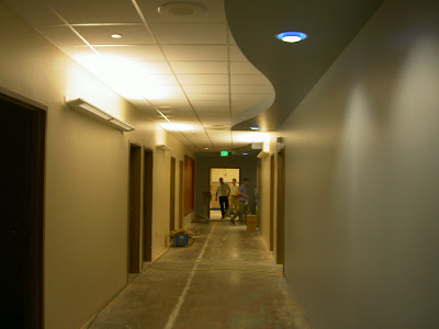


Thanksgiving evening we gathered around our living room to watch a film – While You Were Sleeping. Despite its charming and romantic plot, it was easy to discern the movie’s age due to the fashion and humor changes during the last 15 years. In contrast, its hospital interiors accurately reflected what I would expect to see today. In other words, changes in fashion, language and humor were easily identifiable though the architecture and interiors did not seem to change at all. As a design student, I was taught to believe that the built environment acted as a cultural catalyst for change and critical thought. Unfortunately, it no longer seems to hold this position, instead it trails dreadfully behind art, technology, and design – especially in healthcare design.
Creativity is hidden behind a sturdy wall of excuses in healthcare design. This wall is several feet thick – built by the value engineers, the financers, the doctors and nurses, hospital CEOs and administrative staff, lawyers, technicians and even architects. Finding a way to introduce innovation in healthcare design is like looking for a tiny crack in a dam. It is not surprising that most designers settle for the “usual” due to frustration and impatience.
I searched and researched for several weeks – looking for a tiny crack in the wall. I composed presentation boards showcasing “cutting edge” European designs and the most updated scientific research supporting color and technology alternatives… but every time they would find an excuse, a reason, something, anything, to avoid pursuing solutions outside of the familiar white washed walls, long, straight corridors, and VCT rigid squares.
After months of research and meetings, an administrative officer asked about using energy efficient lighting and updating the current standardized fixtures. Without my input, the board of directors, planners, lawyers, etc. quickly agreed to update the standard – revealing the perfect crack. Through innovative lighting fixtures, I could design in creative and unexpected ways. I suggested using color changing LED light fixtures as decorative and functional pieces in hallways, waiting rooms, and lobbies. Other fixtures could be used to cast unusual and artistic shadows on walls – spaces typically covered with framed paintings. These fixtures were able to escape the regular list of excuses and hesitations because they were necessary – essential for both function and design.

1 comment:
i so agree with you nikki!
Post a Comment