Version 1 is a repeat of the Cracked Version introduced earlier so I'm not posting it here. Version 2 is focused on intensity and color. The pattern increases in size as pain increases and this band experiments with color. Blue represents less pain while red represents the most pain.

Versions 3 and 4 are based on survey results - how people imagine pain in color and image. As most people said they see pain as a bottomless hole or a burning sun, I created abstract images to represent this. The sufferer can wear a simple color band based on their personal preference. Do you see pain as blue to red or as a gradient from white to gray? In the cases shown, white and blue would equal less pain while black and red would equal the most pain. These versions are an attempt to move away from focusing on pain intensity to how pain feels.


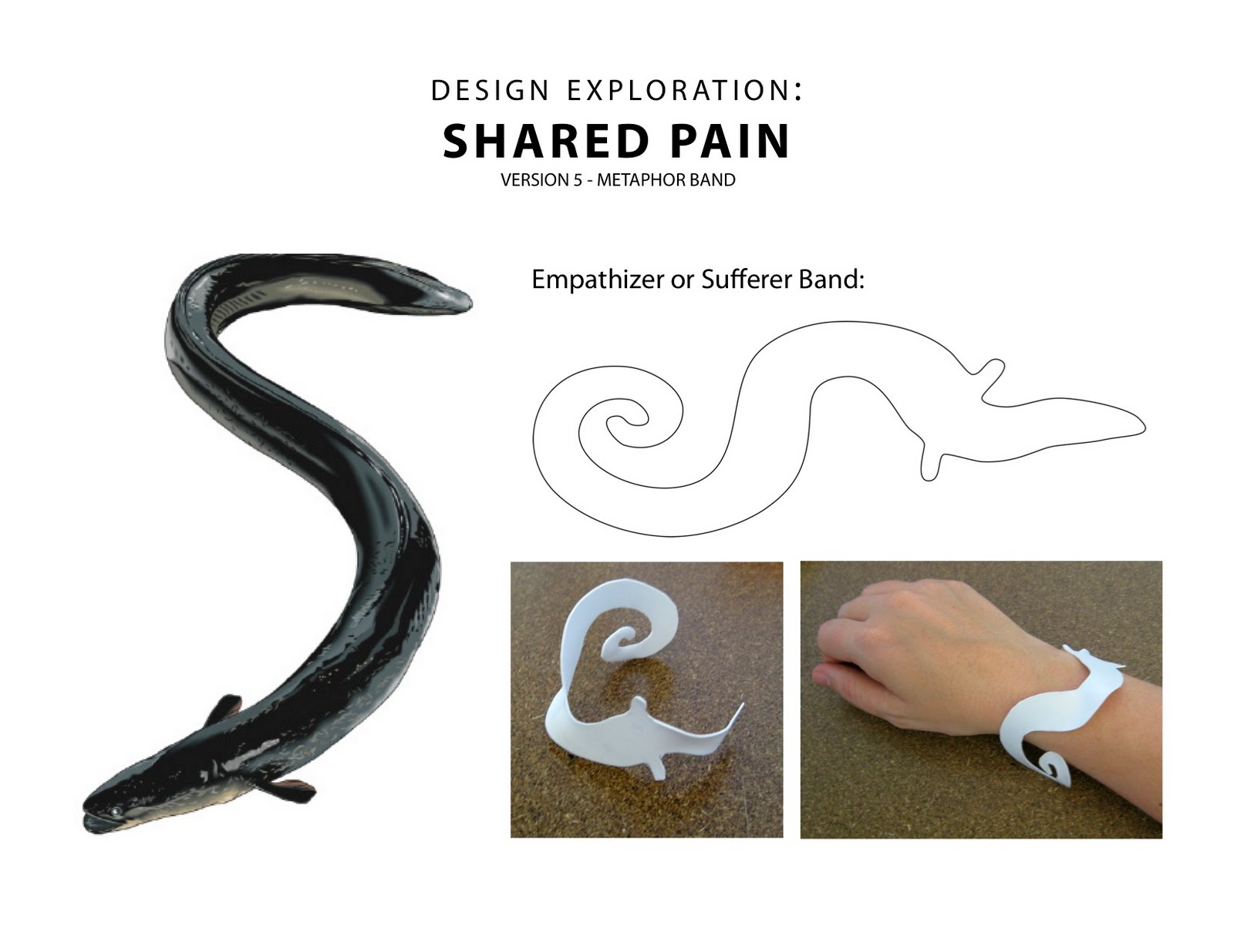
And finally, Version 5 is based on animal metaphors. I asked a few people, "If your pain were an animal, which one would it be?" and several people said "eel" so I created an awareness band (no electronics or communication) inspired by this idea. I think the animal metaphor allows people to focus on how they feel rather than on the amount of pain they experience. Supporters and friends can wear it to raise awareness on how chronic pain feels.
My contact information: If you would like to participate in my research in any way, please contact me directly via email at niknox@gmail.com
Thank you!