
Version 1 is a repeat of the Cracked Version introduced earlier so I'm not posting it here. Version 2 is focused on intensity and color. The pattern increases in size as pain increases and this band experiments with color. Blue represents less pain while red represents the most pain.

Versions 3 and 4 are based on survey results - how people imagine pain in color and image. As most people said they see pain as a bottomless hole or a burning sun, I created abstract images to represent this. The sufferer can wear a simple color band based on their personal preference. Do you see pain as blue to red or as a gradient from white to gray? In the cases shown, white and blue would equal less pain while black and red would equal the most pain. These versions are an attempt to move away from focusing on pain intensity to how pain feels.


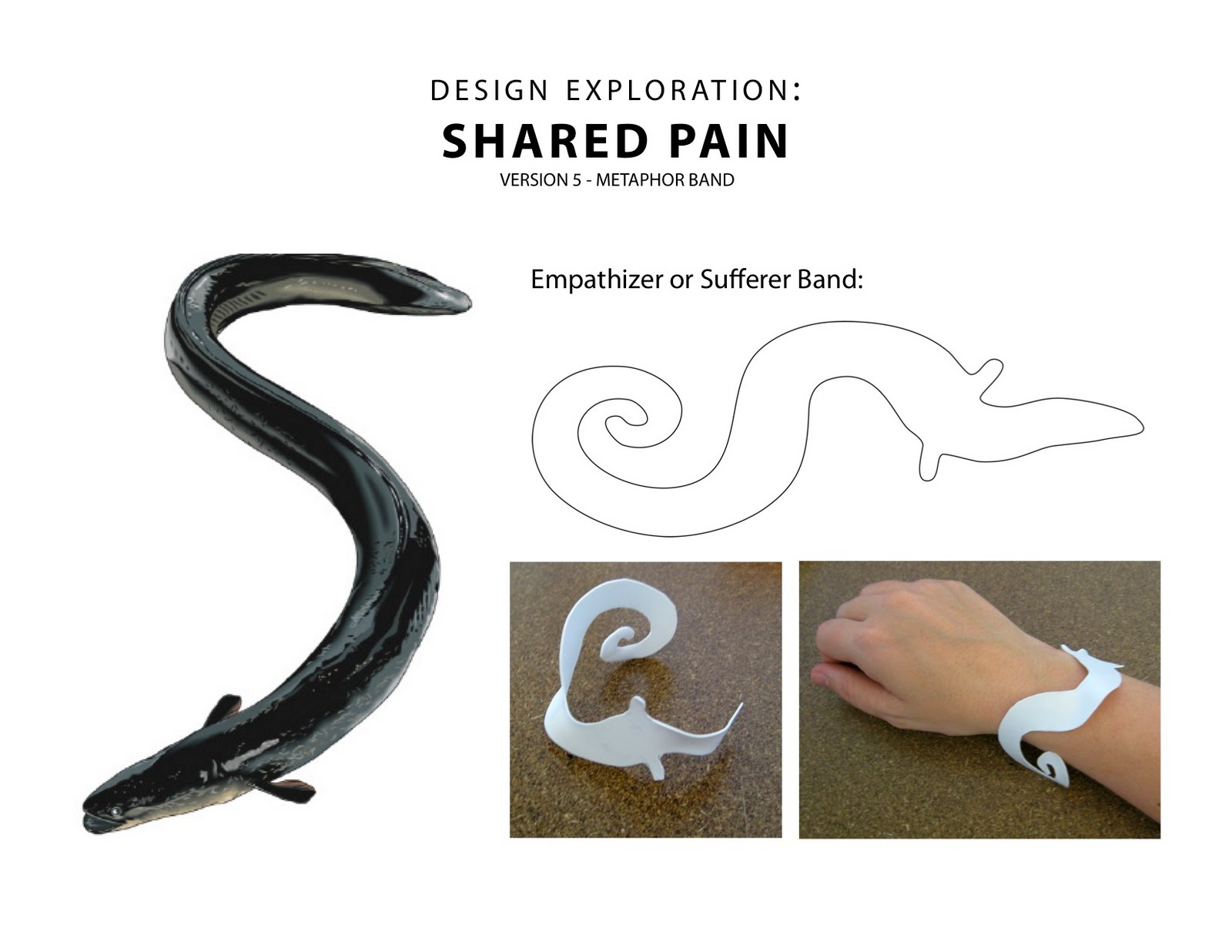
And finally, Version 5 is based on animal metaphors. I asked a few people, "If your pain were an animal, which one would it be?" and several people said "eel" so I created an awareness band (no electronics or communication) inspired by this idea. I think the animal metaphor allows people to focus on how they feel rather than on the amount of pain they experience. Supporters and friends can wear it to raise awareness on how chronic pain feels.
My contact information: If you would like to participate in my research in any way, please contact me directly via email at niknox@gmail.com
Thank you!

2 comments:
The bracelet is a really good idea, I have a few opinions on these designs. I only get occasional migraines and do not suffer from severe chronic pain and I'm not sure of all the differences in what provokes/worsens daily pain so you will want other opinions. My artistic opinion is that the intensity design is by far the best and most appealing, but there is something about patterns that irritates me when I have a migraine. Even sometimes when I don't, looking at precise patterns can make me feel like I'm going to get one. I can't keep myself from focusing on patterns and it turns into a pulsating feeling.
I think the dots changing in size is very effective and easily understood. Maybe if the larger dots were just lighter on the sufferer's bracelet. Then it would not potentially worsen a migraine by sticking out too much.
As for the other designs, I think the cracked one is good too, but the other 3 look a little childlike. I hope this was helpful. Good luck, if this succeeds it will be a great step forward.
My opinion is still that the cracked design is best - as I have said previously - sometimes I feel "broken" and I have a good sense of humor about it - I can see how others might not. But, it may be a great ice breaker with friends and family.
I couldn't do the dot pattern due to migraines. I suffer constant intractable migraines - never without it - and when pain increases, this design would be difficult to look at. The others are just "eh" to me. And I could not wear and eel on my arm cause I'd feel creeped out!
Thanks - I left you my email in your last post!
Elizabeth
Post a Comment